Analyzing Target Group
You can significantly improve the understanding of your target group by visually analyzing its bar or pie distribution charts.
Using Bar Charts
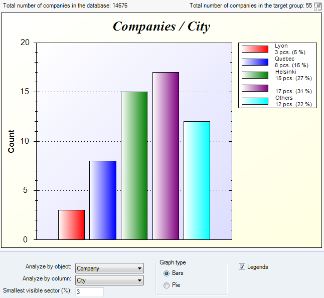
Bar charts are best for comparing percentages of objects All information in Vine is stored in the server database as named objects of different types. Examples: a company, a person, an event, a sales case. which fall within categories specified by the legend. Multiple colors and labels are used to differentiate one bar from another.
The height of a bar corresponds to the vertical axis which goes from 0 to 100%, with a maximum of 100% representing the total number of objects of the type selected from the Analyze by object list In lists objects are represented by small icons and object names. Icons help you to recognize object types. Press a keyboard character (a letter or a digit) to jump to the list item that starts from this character. The first matching item will be chosen, counting from the top of the list..
The categories of the legend are the values of the field selected from the Analyze by column list.
Bars corresponding to percentages below the value specified in the Smallest visible sector box are not shown. The default value is 1%.
Using Pie Charts
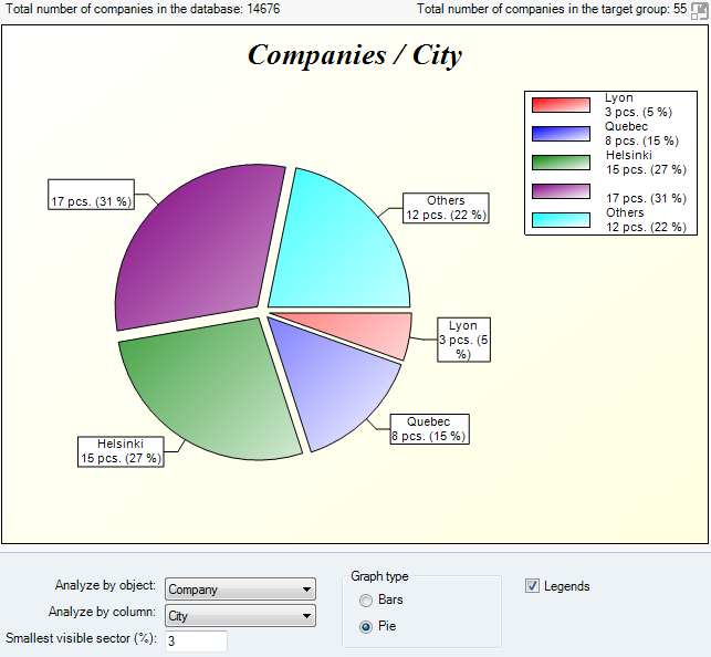
Pie charts show how partial quantities of objects specified by the legend relate to the total number of database objects of the chosen type. They show data in the form of sectors each representing a percentage of all the objects.